DuckDB Aggregating CandleSticks by Dates
What is a Candle Stick Chart?
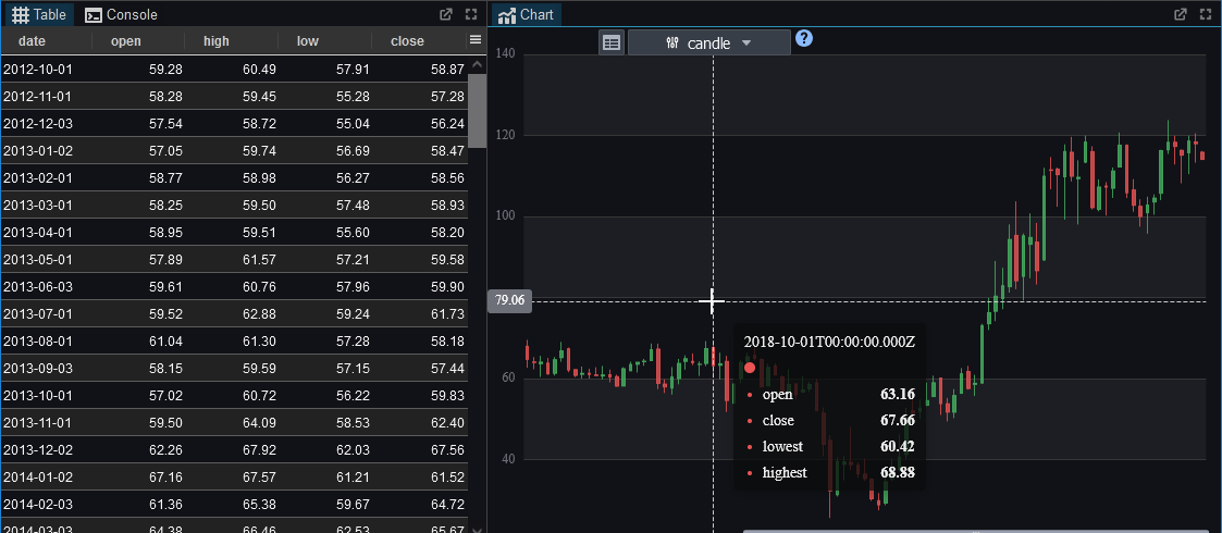

A Candlestick Chart is a type of financial chart commonly used to represent the price movement of an asset, typically in stock, commodity, or cryptocurrency markets. It visually displays the opening, closing, high, and low prices for a specific time period (e.g., one day, one hour, etc.) in a simple, easy-to-read format.
CandleStick SQL Example
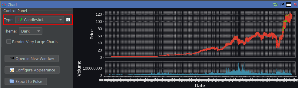
The data in our stocks table already contains OHLC format and can be simply queried to allow plotting in QStudio:
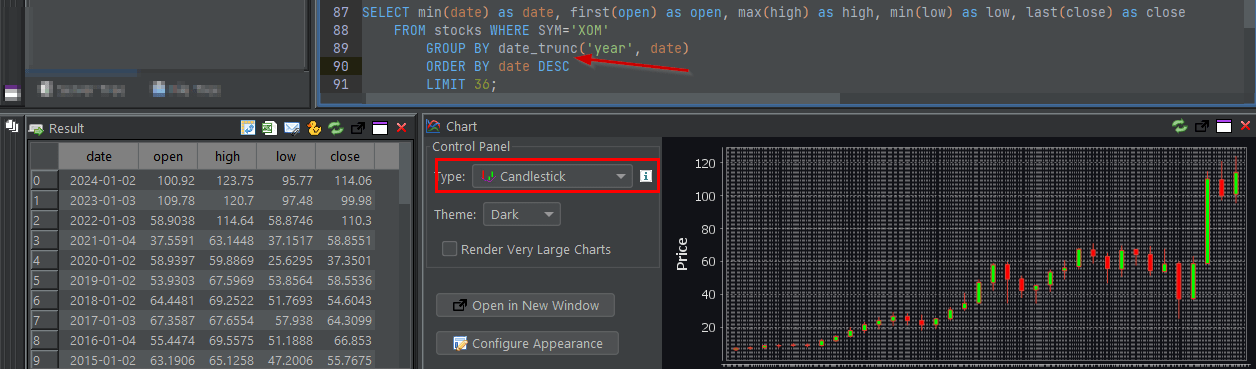
OHLC by Month/Year
As you can see from the graph, there are too many data points to sensibly visualize fully zoomed out. What if we "zoomed out" the granularity. For example find the OHLC by month or year. We can do this using the below SQL:
date_trunc(precision, date) is used to truncate dates to the selected precision.
e.g. GROUP BY date_trunc('month', date) truncates to month and groups all the values to those boundaries.