Archive Page 6
November 29th, 2022 by John Dempster
A massive thanks for those that got in touch last month to wish us well on our new product launch. It has been exciting seeing the uptake and receiving user feedback. A particularly big thanks to JP/VS/JC/IL and MC.
Based on user requests, the largest developments since last month have been:
- Security integration – to allow firm wide rollout. We now support both Apache proxies and kdb based authentication.
- Chart Customization – Configuration of 100+ chart attributes from the UI.
- Improved PostgreSQL support – Expanded query support and updated drivers.
If you need fast visualization or tableau is proving too slow, this is your chance to get in early and help steer development to solve your problem.
Contact us, if you have any feedback or need assistance with configuration.
Issues can be posted to github and source is available for customers.

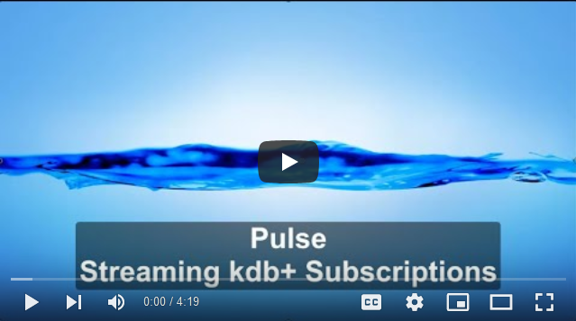
Pulse – kdb+ Streaming Subscriptions
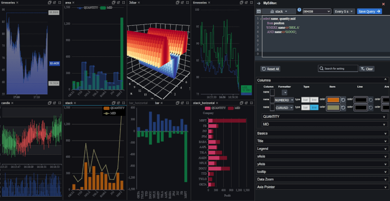
Pulse – example customization
November 29th, 2022 by John Dempster


// Real-time kdb+ data visualization
Pulse is a tool that allows you to create and share real-time interactive dashboards with your team.
It’s been almost ten years since the launch of qStudio and our original sqlDashboards.
We have seen the need for fast real-time interactive dashboards increase.
Quants increasingly want to build, deploy and roll out visualizations faster and more reliably.
As such we are excited to annnounce Pulse, an HTML5/react based solution that allows you to build a dashboards based on kdb+ or postgresql or mysql data.
It’s early days and the product is under heavy development:
- New features will be released at least monthly
- We expect to offer a 1 year license for £199
- A free 50-day trial version can be downloaded at timestored.com/pulse
If you have a need for fast visualizations that you haven’t solved or tableau is proving too slow, this is your chance to get in early and help steer development to solve your problem.
October 12th, 2022 by Ryan Hamilton
qStudio is the number one code editor, server browser and development environment for kdb+.
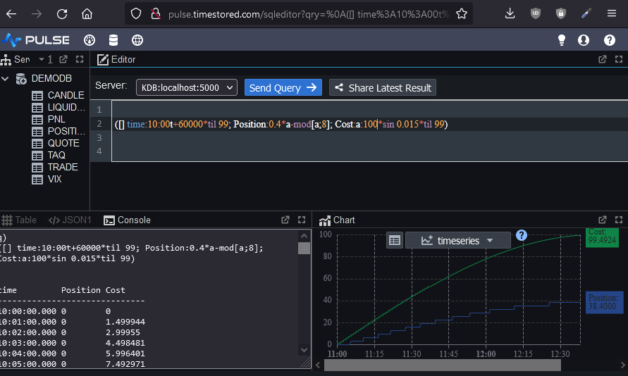
Today we are launching Pulse, a real-time SQL visualization tool for almost any SQL database.
Within Pulse we have recreated almost all the functionality of qStudio in web form.
If you’ve ever wanted to:
- Share queries and results
- Run analysis from any machine with a browser without a need to install qStudio
- Chart results using a modern charting library
You should consider using Pulse as a shared HTML5 based complement to qStudio..
As you can see below, pulse can be made to look almost the exact same as qStudio. It features the familiar configurable layout with a table/console/charting result panel that allows you to see your result in all formats at once.
Additionally you can
- Bookmark,copy and share links
- Use it with kdb+, postgresql, mysql, oracle and H2 databases
- Try many more chart types including 3D.
Try Pulse Now
June 13th, 2021 by admin
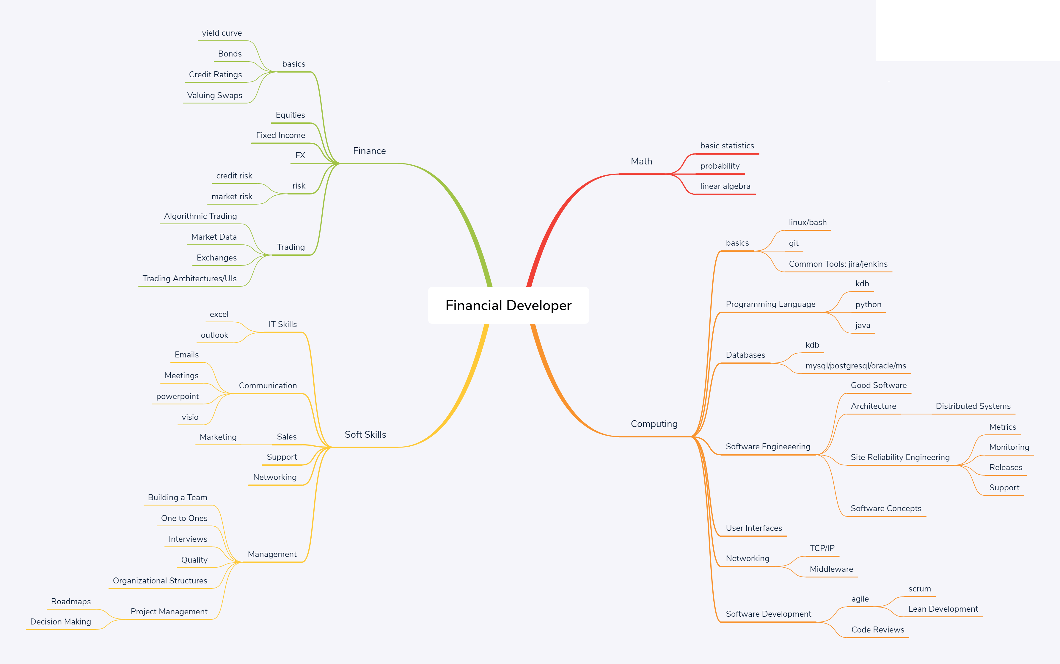
The below network diagram is intended as an outline of the skill set required for a financial software developer.
Note:
- Most individuals should aim to have a strong core. Think of it like a pyramid, where the height is the strength of a skill. Core skills like general computing principles, probability, communication should be built “tall” and very strong. peripheral skills such as python/monitoring will be weaker. An individual will typically only learn 1 or 2 niche areas strongly (T shaped)
- Notice the rough relative sizes of the areas. 55% computing, 10% math, 15% soft skills, 20% finance. This is intended to represent the rough allocation of effort.
- If you only bring 95% techinical skills, you are going to waste time building the wrong thing, build something no one wants or build something useful but no one will know as you haven’t the soft skills to sell it.
- The management branch on the bottom left is optional.
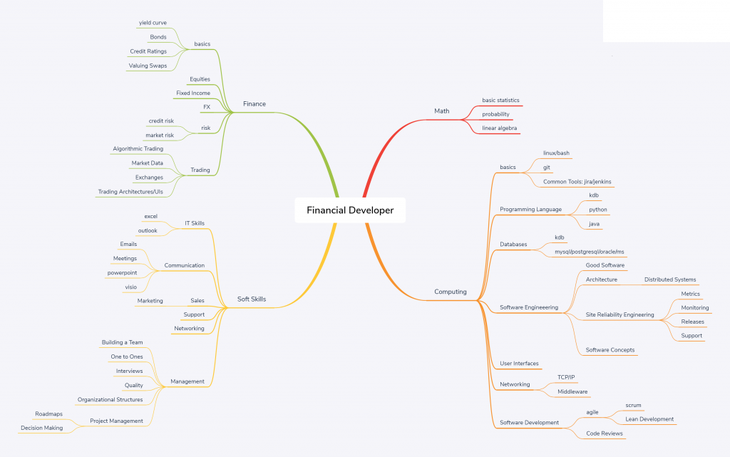
Computing
| Skill |
Topic |
Sub-Topic |
Links |
Requirement |
| basics |
|
|
|
|
| linux |
|
surrey |
Change Directories, edit config files, kill processes, copy/move files, check disk space. |
| bash |
|
tldp.org |
Write a script to periodically sync a directory between servers and schedule it using cron. |
| git |
|
git-scm |
Checkout, branch, commit, push code. |
| Common Tools: jira/jenkins |
|
user-stories |
Write a good jira, assign owner. Kick off a build on a common CD platform. |
|
|
|
|
|
| Programming Language |
|
|
|
Knowledge of 2 different programming paradigms. |
| kdb |
|
kdb-tree |
Write efficient selects for pulling back a subset of data. |
| python |
|
|
Download data from a REST api, calculate average/mean/median for certain metrics. |
| java |
|
book |
Write a java program to count the number of words in a file. |
|
|
|
|
|
| Databases |
|
|
|
Be aware of the major types of database available and when to use each. |
| kdb |
|
kdb-tree |
|
| mysql/postgresql/oracle/ms |
|
|
Know standard SQL. |
|
|
|
|
|
| Software Engineeering |
|
|
peopleware |
How to grow good software. |
| Good Software |
|
|
Properties of good software with examples. |
| Architecture |
|
|
Common Enterprise software patterns. |
| Distributed Systems |
|
Difficulties with distributed systems and common patterns to solve them. |
| Data Processing Pipelines |
|
Common processing Pipeline Patterns |
| Site Reliability Engineering |
|
SRE |
How reliable should software be? |
| Metrics |
|
Ccommon metrics used to measure reliability and when to use each |
| Monitoring |
|
What monitoring systems/tools are available? What are monitoring best practices? |
| Releases |
Accelerate |
|
| Support |
|
Handling outages. Engaging with users. |
| Software Concepts |
Testing |
|
Testing Methods and knowledge of one test framework |
|
|
|
|
|
| User Interfaces |
|
|
dont-think |
What makes a good user interface? |
|
|
|
|
|
| Networking |
|
|
|
How computers connect. Expected latency/bandwidth. |
| TCP/IP |
|
|
ports, switches, racks, data centres, windows. |
| Middleware |
|
|
Messaging midddleware: solace/JMS/kafka/MQ. |
|
|
|
|
|
| Software Development |
|
|
|
|
| agile |
|
|
|
| scrum |
book |
Sprints, iterations, standups, restrospectives, story-time. |
| Lean Development |
lean-startup |
When, why and how to develop lean. |
| Code Reviews |
|
pragma |
Code review best practices. |
Soft Skills
| Skill |
Topic |
Sub-Topic |
Links |
Requirement |
| IT Skills |
|
|
|
|
| excel |
|
|
Create a table with conditional formatting, calculate sum/average of column, use vlookup |
| outlook |
|
|
Filter emails, create meetings. |
|
|
|
|
|
| Communication |
|
|
|
|
| Emails |
|
|
How to write an email to users, team mates, managers, senior management. |
| Meetings |
|
atlassian |
What is a meeting meant to accomplish? How to achieve that. |
| powerpoint |
|
|
Prepare a presentation for management. |
| visio |
|
|
Draw an architectural diagram of your system. |
|
|
|
|
|
| Sales |
|
|
|
|
| Marketing |
|
Traction |
How to get your software used and appreciate by more users. |
| Support |
|
|
|
|
| Networking |
|
|
|
Building a network to get things done. |
|
|
|
|
|
| Management |
|
|
Grove |
|
| Building a Team |
|
Dysfunctions |
|
| One to Ones |
|
|
What makes a good one-to-one |
| Interviews |
|
|
How to evaluate cnadidates effectively. |
| Quality |
|
|
How to ensure quality of product. |
| Organizational Structures |
|
phoenix |
Different structures for management. |
| Project Management |
|
|
|
| Roadmaps |
|
|
| Decision Making |
|
Which approach to decision making to use when. |
June 13th, 2021 by Ryan Hamilton
This article was drafted in 2019, given it’s 2021 it made an interesting look back and sadly still a look forward….
There have been two big changes in the software world:
- The Cloud
- Community collaboration
Winners and Losers
From these shifts, there have been winners and losers
- Community helped Wikipedia build the best encyclopaedia
relegating Britannica and Encarta to history.
- Community helped linux become the dominant operating system
Solaris/OS2 systems are now, only used in legacy niches
- Community developed python is replacing matlab
- Cloud has seen atlassian/github/amazon/salesforce etc . win by offering SAAS solutions
to replace what would previously have been locally installed software (SAP/perforce)
- Cloud hosted Gmail/Hotmail has replaced companies running their own mail servers
If kdb doesn’t change it will become a legacy platform with developers maintaining legacy systems that over time will be replaced with modern cloud alternatives.
Therefore we are starting two initiatives:
Cloud native KDB
- A fully-managed time-series database hosted on google cloud
- Able to be signed up for and used within 10 minutes
- Clear predictable pricing based on storage and query usage
- Hiding all the complexity of kdb (no par.txt/segments/sym file manipulation)
- While providing access to the speed and expressiveness of the language
- Taking advantage of modern load balancing (kubernetes) And cheap storage (S3)
We have a skunkworks team based in their own office, tasked with making a kdb database cloud solution so reliable and feature rich your kdb expert can now stop working to keep the database running and instead focus on business problems.
Community Driven q
We want kdb to run everywhere, for the barriers to adoption to drop and for the language to expand what it can do. A new kdb user will be able to run kdb on their machine through their standard package manager and to access a whole library of utilities to help them with whatever task they are trying to achieve.
KDB everywhere
To do this, we’ve formed a committee including representatives from finance/education and the wider community to:
- Open source the q language
- Development possibilities will be opened up to the wider community as anyone can submit ideas or even PRs for experimental functionality
- Being open source allows kdb to be bundled with linux and we see this as allowing wider use of q scripts
- Create a hosted packaging system that allows reusing code easily similar to NPM/maven
- Providing a wider library of community maintained packages that are easily reusable
- Work with aquaq to migrate parts of their torq framework to provide a kdb standard library
- Work with the community to onboard some of their code as packages
e.g. TimeStored is donating qunit
- Provide a recommended SDLC for kdb. Over the years we’ve developed processes for end to end development of q code at scale and we will be providing that same tooling to everyone.
By both open sourcing the language and allowing easier development of shareable packages we accelerate the pace at which kdb can help all developers solve problems and share solutions. Making the kdb platform stronger for everyone.
The Future of kdb is with you
It’s an exciting time and the demand for storing and analysing large time-series is growing. We believe by becoming cloud first and community driven we can continue to provide solutions for many years to come.
June 13th, 2021 by Ryan Hamilton
Features I want:
- Open Sourced kdb (a person can dream). As one of the top 5 tools in my programmers toolbox it’s frustrating that kdb is closed source. I can’t use the tool everywhere and at any time the price can be increased.
- Increase ease of Use
- Block user queries that will obviously kill the database (select from quote).
- Do not quit out when a query takes too much memory (-w exceeded or all RAM/swap on box gone.). Sensibly return an error and keep going.
- Faster Speed – Admittedly this isn’t a strong requirement for any work I do but it irritates me as a programmer to know some easy 10x speed improvements are not being used.
- Perform warmup queries and counts on startup automatically to get most recent data into memory.
- Replace the kdb/q code with CPU vector functions
- Parse the user query and optimize it. If a user sends “select from trade where a=1,b=2,c=3,d=3” automatically order the evaluation of the where clause to at leaast prioritize those with attributes.
- Marketing – I didn’t think this would be on my wishlist…but if you can market kdb better I would love to stop having people suggest I use mongodb/hadoop/latestFad when kdb is a great fit for the problem at hand.
October 24th, 2020 by admin
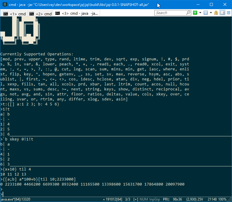
Jq has now added support for:
- Functions – {x+1}. Unnamed parameters beyond x don’t yet work so please name all your parameters.
- Keyed table operations: xkey, 1!, 2!, keys, value.
- New keywords supported: in, distinct, inter, except, rank, sv, vs, sum, prd, xlog.
- Improved compatibility and support of: null, avg, var, iasc, upper, lower, fills, fill, ^, sublist, prds, sums.
The added keywords in most cases will only support the most common types and arguments.
Mixed lists in particular are not handled well by most keywords but we will continue to improve.
September 9th, 2020 by admin
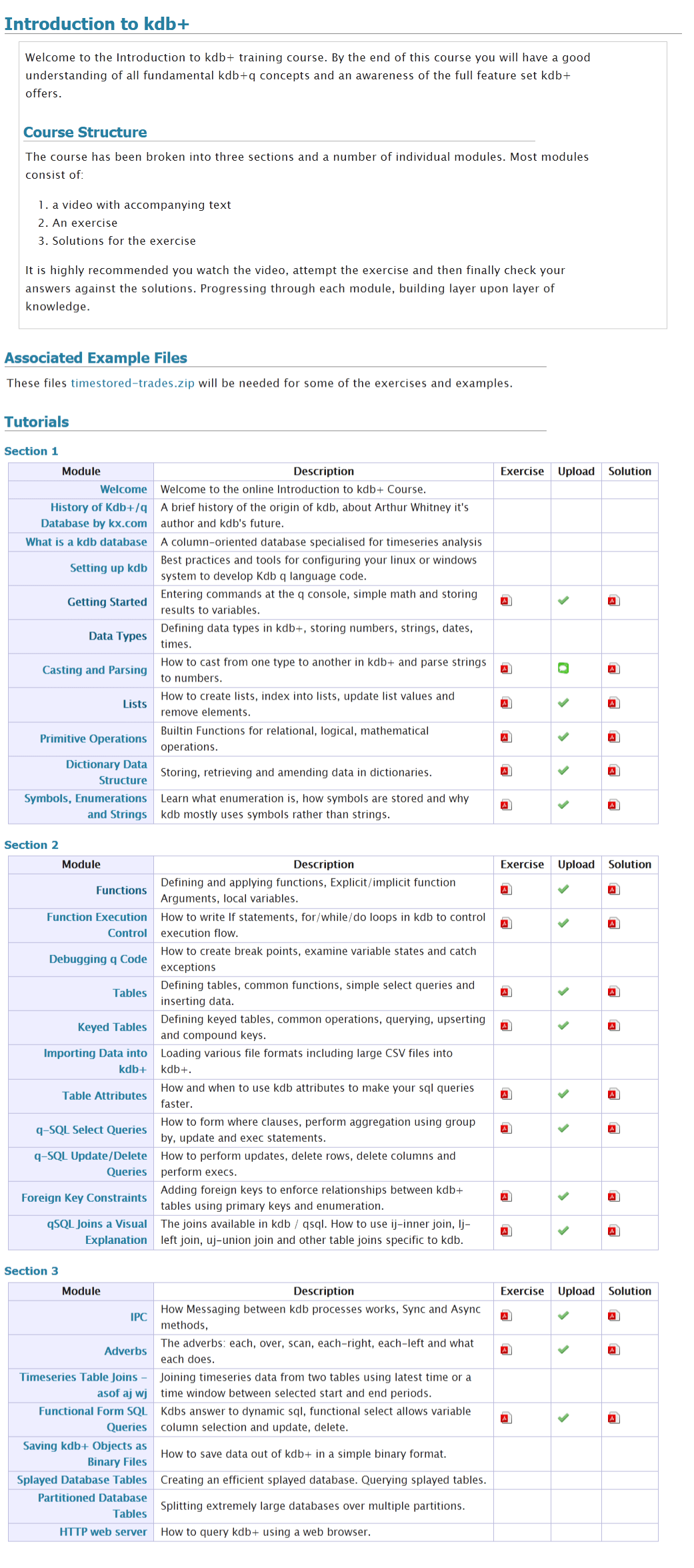
We often get asked what is in our online training course.
We do describe this on the course page and in a PDF to be be totally thorough here’s a screenshot of our full listing:
January 22nd, 2020 by admin
Shakti
The biggest shakeup in the KDB world was Arthur Whitney, the founder of KX and creator of KDB selling his stake in KX and moving on to creating a new version of the K language called Shakti. “Shakti merges database, language, connectivity and stream processing into one powerful platform “. So far it appears to overlap heavily with kdb functionality, adding further cryptographic features, while not yet supporting on-disk storage.
KDB Version 3.7 Changes:
- App Direct Mode – give users control over Intel Optane DC Persistent Memory.
- Multi-Threaded Primitive Operations
- Data at Rest Encryption.
KDB Version 3.6 Changes:
- Websocket – Improvements and bugfixes
- Speed Improvements
- When attributes present use them more often.
- Improved Error Reporting
- Broken or closed handles report their number
- Fatal memory errors log a timestamp
FD/KX Products:
January 22nd, 2020 by admin
kdb Version 3.6 Changes:
- Enums and linked columns now use 64 bit indices
- This is a disk-format change, i.e. newly saved data will NOT be backwards compatible.
- 3.6 will be able to read data in the old format
- AnyMap – Mapped Nested Types
- Ability to save unmappable compound objects with >2 billion elements
- Mapped list elements can be of any type and are data remains mapped NOT copied to heap.
- Symbols are automatically enumerated against a file with three ###s in the name.
- Deferred Response – -30!x Allows a deferred response to a sync query. In practice it is difficult to use correctly.
- New Functions:
- .Q.hg – HTTP get allows retrieving web page as a list of strings.
- .Q.dtps/.Q.dpfts added to allow specifying the enum domain
- .Q.sha1 – SHA-1 encode text
- .Q.ts – Allows timing a function call similar to apply “.”.
- xcol – Now supports dictionary to remap column names
- -27! to allow formatting similar to .Q.d
- .j.jd – Allows specifying dictionary of options when calling json serialization.
- .Q.btoa – Base 64 encode
- .Q.hp – HTTP Post – .Q.hp[url;mimeType;query]
- Performance Improvements on
- grouping
- filtering
- particularly when attributes present
- SSL – Improvements and bugfixes
- WebSockets – Improvements and bugfixes