Archive for the 'kdb+' Category
September 9th, 2020 by admin
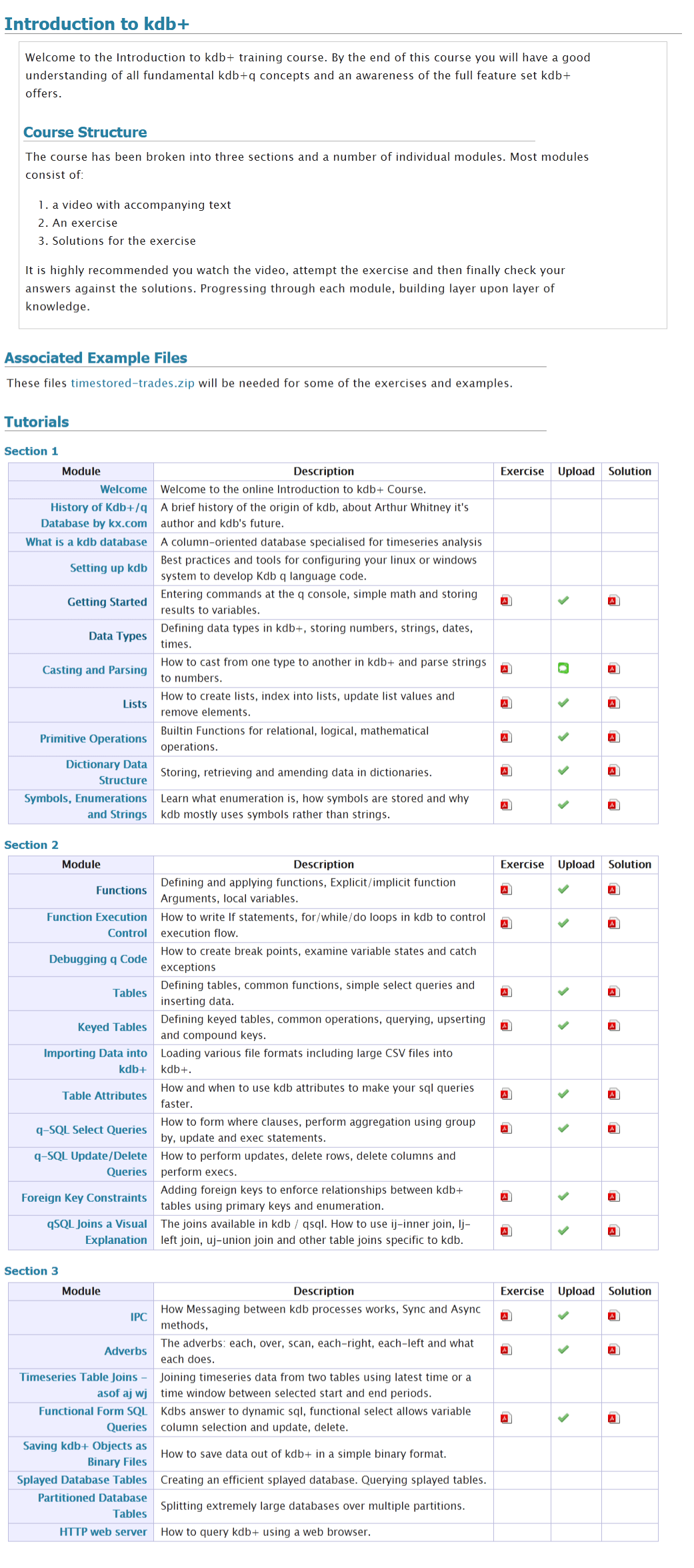
We often get asked what is in our online training course.
We do describe this on the course page and in a PDF to be be totally thorough here’s a screenshot of our full listing:
January 22nd, 2020 by admin
Shakti
The biggest shakeup in the KDB world was Arthur Whitney, the founder of KX and creator of KDB selling his stake in KX and moving on to creating a new version of the K language called Shakti. “Shakti merges database, language, connectivity and stream processing into one powerful platform “. So far it appears to overlap heavily with kdb functionality, adding further cryptographic features, while not yet supporting on-disk storage.
KDB Version 3.7 Changes:
- App Direct Mode – give users control over Intel Optane DC Persistent Memory.
- Multi-Threaded Primitive Operations
- Data at Rest Encryption.
KDB Version 3.6 Changes:
- Websocket – Improvements and bugfixes
- Speed Improvements
- When attributes present use them more often.
- Improved Error Reporting
- Broken or closed handles report their number
- Fatal memory errors log a timestamp
FD/KX Products:
January 22nd, 2020 by admin
kdb Version 3.6 Changes:
- Enums and linked columns now use 64 bit indices
- This is a disk-format change, i.e. newly saved data will NOT be backwards compatible.
- 3.6 will be able to read data in the old format
- AnyMap – Mapped Nested Types
- Ability to save unmappable compound objects with >2 billion elements
- Mapped list elements can be of any type and are data remains mapped NOT copied to heap.
- Symbols are automatically enumerated against a file with three ###s in the name.
- Deferred Response – -30!x Allows a deferred response to a sync query. In practice it is difficult to use correctly.
- New Functions:
- .Q.hg – HTTP get allows retrieving web page as a list of strings.
- .Q.dtps/.Q.dpfts added to allow specifying the enum domain
- .Q.sha1 – SHA-1 encode text
- .Q.ts – Allows timing a function call similar to apply “.”.
- xcol – Now supports dictionary to remap column names
- -27! to allow formatting similar to .Q.d
- .j.jd – Allows specifying dictionary of options when calling json serialization.
- .Q.btoa – Base 64 encode
- .Q.hp – HTTP Post – .Q.hp[url;mimeType;query]
- Performance Improvements on
- grouping
- filtering
- particularly when attributes present
- SSL – Improvements and bugfixes
- WebSockets – Improvements and bugfixes
November 25th, 2018 by admin
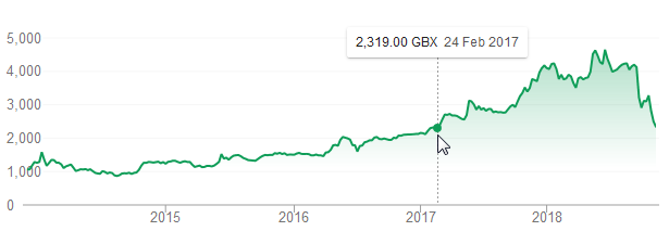
First Derivatives Shares have fell back to a price last seen in February 2017:
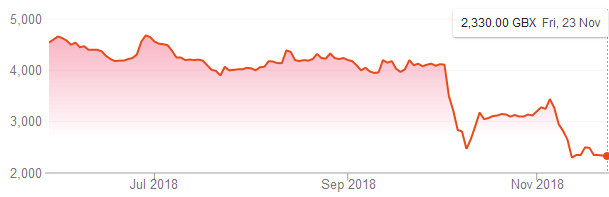
One cause of the fall has been a damning article by ShadowFall. Their main arguments are:
- First Derivatives was being priced highly as a software company
- It is not a software company but a consultancy.
- Previously good years were due to outside factors (property prices and government grants)
- They have made a significant investment in KX which may itself have stopped growing
The 47 page report goes into a lot of detail, to give an idea here’s one of the charts:
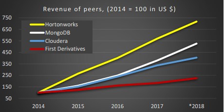
He shows numerous statistics for FD compared to it’s peers, operating margin, gross margin, revenue, headcount. It’s worth a read if you have an interest in kdb/KX/FD.
Related Links: Shadowfall tweet, Independent.ie.
April 2nd, 2018 by admin
qStudio 1.45 Released, we have:
- Bugfix: Ctrl+F Search in source fixed. (Thanks Alex)
- Added Step-Plot Chart display option
- Added Stacked Bar Chart display option
- Added Dot graph render display option (Inspired by Noormo)
- Bugfix: Hidden folders/files regex now works again in file tree and command bar. Target and hidden folders are ignored by default.
- Bugfix: Mac was displaying startup error with java 9
Download
Some example charts:
April 2nd, 2018 by admin
Our standard time-series graph interpolates between points. When the data you are displaying is price points, it’s not really valid to always interpolate. If the price was 0.40 at 2pm then 0.46 at 3pm, that does not mean it could be interpreted as 0.43 at 2.30pm. Amazingly till now, sqlDashboards had no sensible way to show taht data. Now we do:
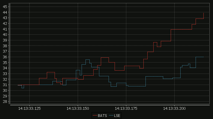
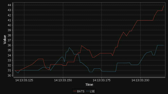
For comparison here is the same data as a time-series graph:
The step-plot is usable for time-series and numerical XY data series. The format is detailed on the usual chart format pages.
April 2nd, 2018 by admin
qStudio has added support for stacked bar charts:
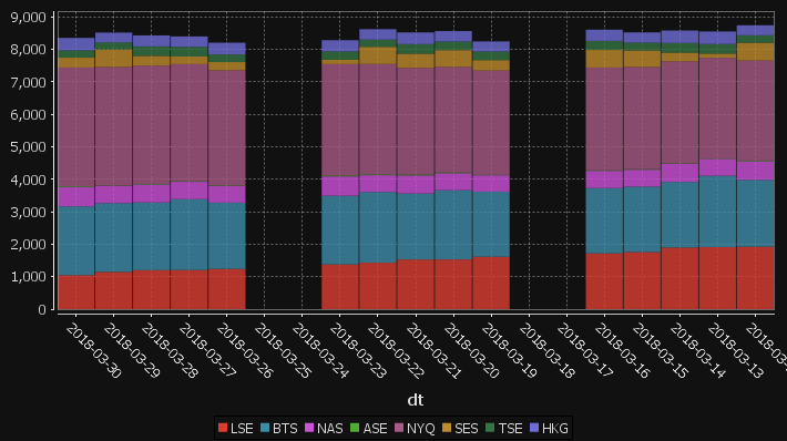
The chart format for this is: The first string columns are used as category labels. Whatever numeric columns appear next are a separate series in the chart. Each row in the data becomes one stacked bar. The table for the data shown above for example is:
| dt |
LSE |
BTS |
NAS |
ASE |
NYQ |
SES |
TSE |
HKG |
| 2018-03-30 |
1047 |
2120 |
592 |
25 |
3660 |
303 |
225 |
383 |
| 2018-03-29 |
1148 |
2118 |
528 |
10 |
3656 |
541 |
215 |
303 |
| 2018-03-28 |
1201 |
2085 |
555 |
17 |
3644 |
302 |
290 |
339 |
| 2018-03-27 |
1206 |
2182 |
535 |
21 |
3604 |
235 |
299 |
319 |
| 2018-03-26 |
1239 |
2041 |
515 |
16 |
3549 |
251 |
234 |
363 |
| 2018-03-25 |
0 |
0 |
0 |
0 |
0 |
0 |
0 |
0 |
| 2018-03-24 |
0 |
0 |
0 |
0 |
0 |
0 |
0 |
0 |
| 2018-03-23 |
1379 |
2115 |
595 |
29 |
3430 |
138 |
251 |
348 |
| 2018-03-22 |
1431 |
2179 |
517 |
25 |
3399 |
531 |
222 |
320 |
| 2018-03-21 |
1530 |
2032 |
558 |
29 |
3282 |
438 |
296 |
359 |
| 2018-03-20 |
1531 |
2134 |
520 |
23 |
3256 |
515 |
265 |
322 |
You may need to “kdb pivot” your original data to get it in the correct shape.
April 1st, 2018 by Ryan Hamilton
“The Financial Information eXchange (FIX) protocol is an electronic communications protocol initiated in 1992 for international real-time exchange of information related to the securities transactions and markets.”. You can see an example of a FIX message being parsed here.
What we care about is that an order goes through a lifecycle. From newly created to filled or removed. Anything that involves state-transitions or a lifecycle can be visualized as a graph. A graph depicts transitions from one state to another. Often SQL tables record every transition of that state. This can then be summarised into a count of the last state, giving something like the following:
| From |
To |
label |
cnt |
| PendingCancel |
Calculated |
Rejected |
50 |
| PendingReplace |
Calculated |
Rejected |
10 |
| PendingReplace |
Calculated |
Replaced |
40 |
| Calculated |
PendingReplace |
PendingReplace |
50 |
| Calculated |
Filled |
Trade |
9400 |
| Calculated |
Calculated |
Trade |
5239 |
| PendingCancel |
Removed |
Cancelled |
150 |
| Calculated |
PendingCancel |
PendingCancel |
200 |
| New |
Calculated |
Calculated |
9660 |
| New |
Removed |
Rejected |
140 |
| Created |
Removed |
Rejected |
300 |
| Created |
New |
New |
9800 |
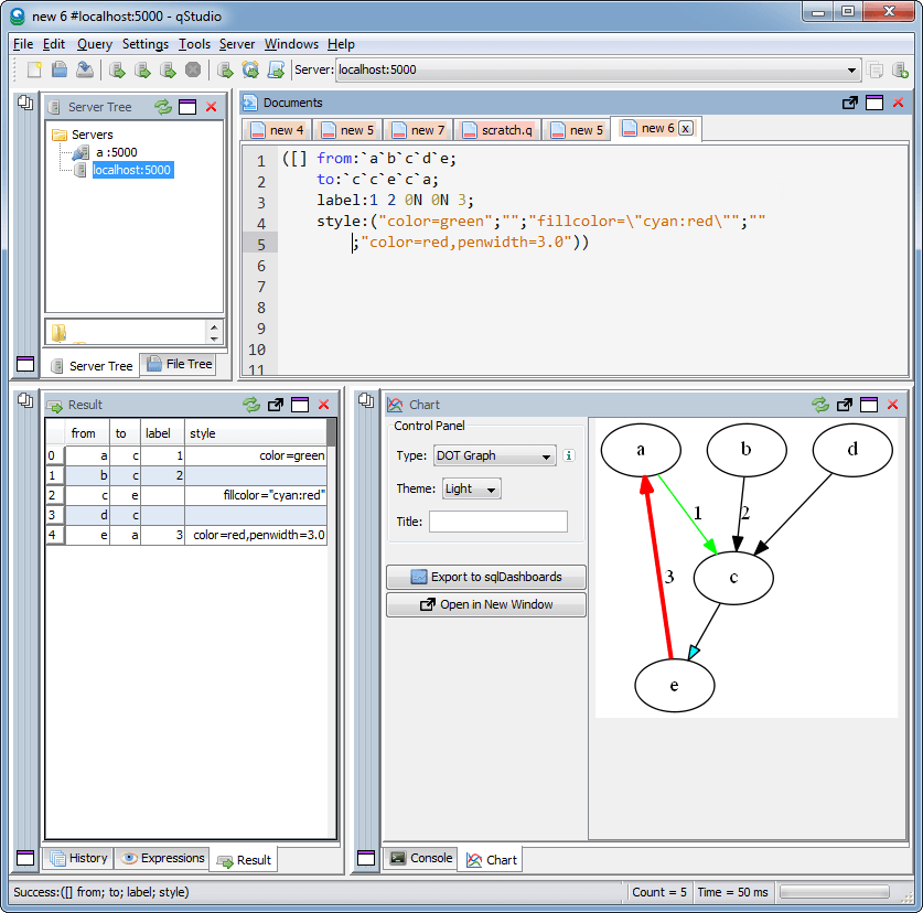
qStudio now automatically converts this result table to DOT format and if you have graphviz“>graphviz installed and on the PATH, will generate the following:
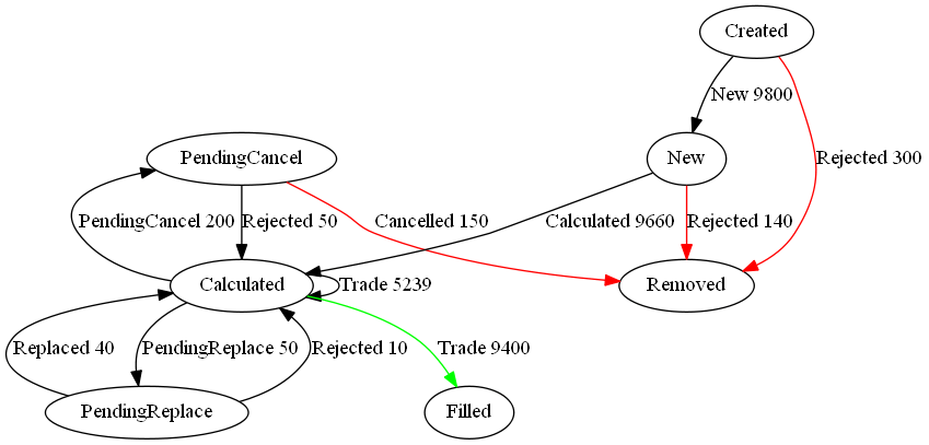
Note I did tweak the table a little to add styling like so:
update style:(`Filled`Removed!("color=green";"color=red")) To,label:(label,'" ",/:cnt) from currentFixStatus
The format is detailed again in our qStudio Chart Data Format page.
This is another even simpler example:
January 13th, 2018 by Ryan Hamilton
Notable events this year or possibly the previous year due to incoherent memory issues:
- KX went open on APIs – Improved and open sourced python, R, java and kafka interfaces.
- Java Driver – Got some new serialization functionality
- PyQ – KX acquired the rights
- The fusion/interface/machine-learning team at kdb promise to keep bringing improvements
- KX went to the cloud – There is now a cloud offering of kdb that is dynamically costed based on usage. It’s for existing customers only so far. Beta is available for personal use but kx may terminate access at any time. You can’t run it on third party “clouds”, no AWS I guess.and costs $0.10 per core <=4 cores, $0.05 per core >4 cores.
- Other users outside finance start to use kdb – It’s great to see and this probably flows from First Derivatives (FD) having purchased KX. However a number of them seem like proof of concepts pushed by FD to demonstrate it can be used. Hopefully in 2018 we will see more independently operating users.
- European Space Agency (ESA) – Al Worden an actual astronaut came to the London meetup with some great stories.
- Partnerships with redbull racing and marketing companies demonstrate possible growth opportunities
- Technical:
- Debugger with Stack Trace – You can now change the number of threads after startup
- uj/ij changes – A change in the behaviour of ij/lj joins means we now have ljf/ujf functions to provide historical equivalents. This is an old change but worth mentioning here as more people are only now upgrading from kdb 2.x
- Analyst – a jupyter notebook / tableau for kdb – KX launched an “analyst” product “a complete real time data transformation, exploration and discovery workflow. Using an intuitive point and click interface, the typical analyst can import, transform, filter, and visualize massive datasets without programming”
December 21st, 2017 by Ryan Hamilton
A quick post to highlight something a lot of people are bumping into with upgrades. The joins in 3.x for uj/ij and lj all changed how they treat nulls from the keyed table. In particular nulls now by default overwrite existing values. In the past nulls from the joining table did not overwrite and left the original value in the column. See the difference in the 3/three row shown below:
q)t:([] a:1 2 3; b:`one`two`three; c:1.0 2.0 3.0)

q)u:([a:2 3 4] b:`j``l; c:100 200 300.0)
q)t
a b c
---------
1 one 1
2 two 2
3 three 3
q)u
a| b c
-| -----
2| j 100
3| 200
4| l 300
q)t lj u / v3.x The null from u overwrites previous value in column b
a b c
---------
1 one 1
2 j 100
3 200
q)t ljf u / v2.0 or ljf - The original 3 value not overwritten by null
a b c
-----------
1 one 1
2 j 100
3 three 200
Other than the int/long indexing change this is one of the biggest breaking changes in migrating kdb 2.x to 3.x.
You may also enjoy our full kdb joins article.