April 2nd, 2018 by admin
qStudio 1.45 Released, we have:
- Bugfix: Ctrl+F Search in source fixed. (Thanks Alex)
- Added Step-Plot Chart display option
- Added Stacked Bar Chart display option
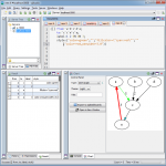
- Added Dot graph render display option (Inspired by Noormo)
- Bugfix: Hidden folders/files regex now works again in file tree and command bar. Target and hidden folders are ignored by default.
- Bugfix: Mac was displaying startup error with java 9
Download
Some example charts:
April 2nd, 2018 by admin
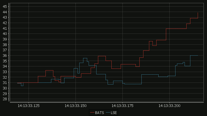
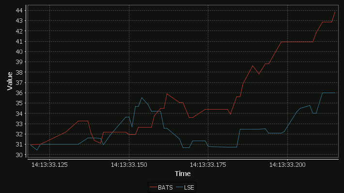
Our standard time-series graph interpolates between points. When the data you are displaying is price points, it’s not really valid to always interpolate. If the price was 0.40 at 2pm then 0.46 at 3pm, that does not mean it could be interpreted as 0.43 at 2.30pm. Amazingly till now, sqlDashboards had no sensible way to show taht data. Now we do:

For comparison here is the same data as a time-series graph:

The step-plot is usable for time-series and numerical XY data series. The format is detailed on the usual chart format pages.
April 2nd, 2018 by admin
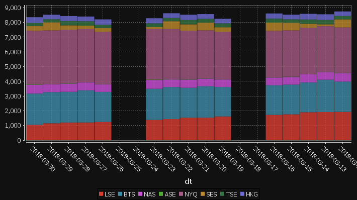
qStudio has added support for stacked bar charts:

The chart format for this is: The first string columns are used as category labels. Whatever numeric columns appear next are a separate series in the chart. Each row in the data becomes one stacked bar. The table for the data shown above for example is:
| dt |
LSE |
BTS |
NAS |
ASE |
NYQ |
SES |
TSE |
HKG |
| 2018-03-30 |
1047 |
2120 |
592 |
25 |
3660 |
303 |
225 |
383 |
| 2018-03-29 |
1148 |
2118 |
528 |
10 |
3656 |
541 |
215 |
303 |
| 2018-03-28 |
1201 |
2085 |
555 |
17 |
3644 |
302 |
290 |
339 |
| 2018-03-27 |
1206 |
2182 |
535 |
21 |
3604 |
235 |
299 |
319 |
| 2018-03-26 |
1239 |
2041 |
515 |
16 |
3549 |
251 |
234 |
363 |
| 2018-03-25 |
0 |
0 |
0 |
0 |
0 |
0 |
0 |
0 |
| 2018-03-24 |
0 |
0 |
0 |
0 |
0 |
0 |
0 |
0 |
| 2018-03-23 |
1379 |
2115 |
595 |
29 |
3430 |
138 |
251 |
348 |
| 2018-03-22 |
1431 |
2179 |
517 |
25 |
3399 |
531 |
222 |
320 |
| 2018-03-21 |
1530 |
2032 |
558 |
29 |
3282 |
438 |
296 |
359 |
| 2018-03-20 |
1531 |
2134 |
520 |
23 |
3256 |
515 |
265 |
322 |
You may need to “kdb pivot” your original data to get it in the correct shape.
April 1st, 2018 by Ryan Hamilton
“The Financial Information eXchange (FIX) protocol is an electronic communications protocol initiated in 1992 for international real-time exchange of information related to the securities transactions and markets.”. You can see an example of a FIX message being parsed here.
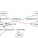
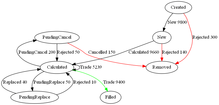
What we care about is that an order goes through a lifecycle. From newly created to filled or removed. Anything that involves state-transitions or a lifecycle can be visualized as a graph. A graph depicts transitions from one state to another. Often SQL tables record every transition of that state. This can then be summarised into a count of the last state, giving something like the following:
| From |
To |
label |
cnt |
| PendingCancel |
Calculated |
Rejected |
50 |
| PendingReplace |
Calculated |
Rejected |
10 |
| PendingReplace |
Calculated |
Replaced |
40 |
| Calculated |
PendingReplace |
PendingReplace |
50 |
| Calculated |
Filled |
Trade |
9400 |
| Calculated |
Calculated |
Trade |
5239 |
| PendingCancel |
Removed |
Cancelled |
150 |
| Calculated |
PendingCancel |
PendingCancel |
200 |
| New |
Calculated |
Calculated |
9660 |
| New |
Removed |
Rejected |
140 |
| Created |
Removed |
Rejected |
300 |
| Created |
New |
New |
9800 |
qStudio now automatically converts this result table to DOT format and if you have graphviz“>graphviz installed and on the PATH, will generate the following:

Note I did tweak the table a little to add styling like so:
update style:(`Filled`Removed!("color=green";"color=red")) To,label:(label,'" ",/:cnt) from currentFixStatus
The format is detailed again in our qStudio Chart Data Format page.
This is another even simpler example:
